Demystifying "Craft"
"Craft" is a buzz word among teams looking to elevate their products. But what does it mean exactly?

“Good design is invisible”
The implication is that the best products are so well crafted, you hardly notice the nuanced design decisions that made them feel so great to use. And the converse — “bad design is hard to ignore”. When something is poorly crafted, it’s hard to get past the poor quality as a detractor of the experience and a poor reflection of a brand.
“Craft” has always been a part of the designer’s jargon but it feels like it’s been trending for the past few years among non-designers as well.
Have a look through any design job board or talk to a hiring manager and you’ll hear:
“We’re looking for a designer with a keen eye for craft.”
“Craft and quality are core to our team.”
“We need someone who can elevate our craft”.
Why the surge in this word’s popularity as a key requirement for designers and product teams everywhere? Maybe a designer who excels at “craft” has unique skills to do something nobody else on the team can. They can stir the imagination with a plausible fiction that feels more real than a product requirements doc. They can bring to life a meaningful product concept so beautiful and elegant that it gets a visceral, emotional response from stakeholders. They can imagine something that people will use, even pay money for, and refine it together with real customers.
It’s more than just polish
There are several challenges with Craft that in my experience even mature organizations grapple with:
Designers aligning on what “good” looks like. From first hand experience I can tell you that designers, who in a RACI model might be assumed Responsible for “Craft”, don’t always have exactly the same idea of what good craft looks like. It’s why designers critique — to provide a more diverse perspective and to chisel away with hopes of turning good ideas into go-to-market products.
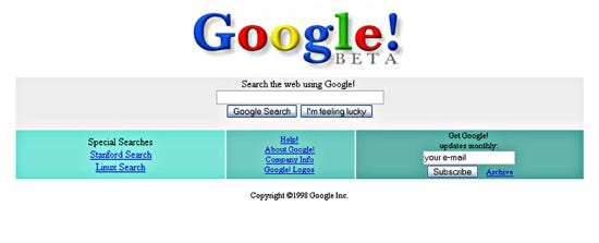
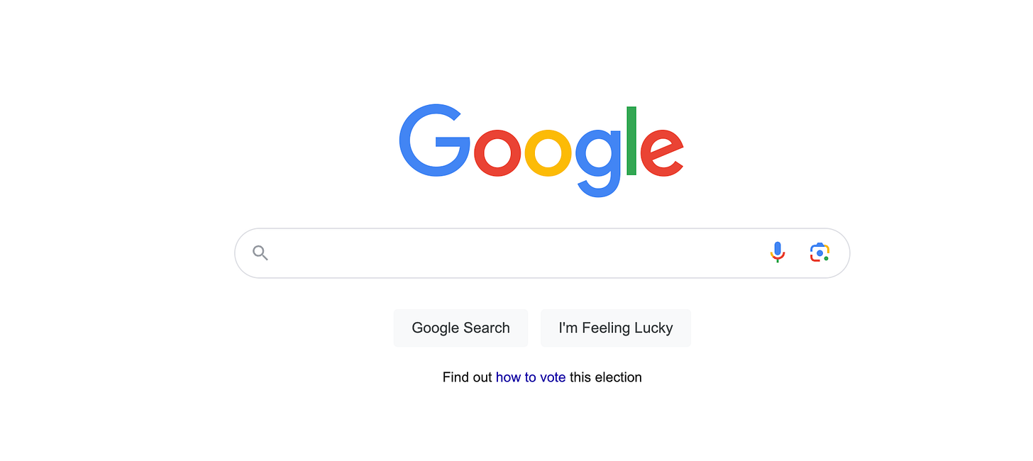
Design trends change over time as well — just look at the first version of Google’s home page then and now. Drop shadows, 3D gradients, indented text fields and shiny buttons today might just send your users running.
Selling the business value of craft. An organization needs to both understand and value craft. How does one communicate that craft actually matters in the grand scheme of every type business (Enterprise, fintech, a scrappy startup) and not just a shiny consumer product?
Making craft everyone’s job. One key misconception I’m hoping to shine a light on is that it is never one designer’s job to create a well-crafted product. It is a multi-disciplinary responsibility, and thus it’s important to educate more teams about what craft is, why it matters and a framework to contribute to making a well-crafted product as a designer, product manager, engineer, product marketing manager, and QA tester.
Good craft depends on the user and business goal. What defines good craft will also heavily depend upon your user’s goals and business outcomes for the products you’re creating.
Below are 3 top travel apps with branding obscured. Beyond beauty, they are different in that they’re optimized for different goals (left to right):
1. Feels like it’s all about quickly finding and booking a place. It’s fairly transactional with dense information. This is where I might go to find the best deals on a hotel.
2. Similar approach to #1, with some modest cosmetic touch-ups like a cleaner UI. Though it’s not perfectly crafted, it may steer some customers from its competitor because it feels more trustworthy, friendly and easy to use.
3. This one focuses on the experience of the trip itself — large swipeable photos, “Guest favorite” badges — with minimal, high value info like price and rating, while providing entry points to robust filters. This is where I’d go to explore possibilities for a unique, elevated experience.
Defining and measuring Craft
By recognizing that Craft is a vague, non-intuitive, subjective term that depends on the brand, context, even user and business goals, you’re able to start the conversation around “what does Craft mean to our users and business, and what does good look like?”
When I was at Meta, some colleagues and I went so far as to set up a “Quality” program where we attempted to define, quantify, measure and report, among others things, a numerical Craft score for our key journeys.
We set out to define a minimum bar we considered launch-worthy — say 4.5 out of 5. We drafted up a heuristic set of quality requirements (ex. adherence to typography system) that when added up, gave a single number representing the health of the product’s craft.
The goal was to make sure our core use cases hit a minimum quality threshold of desirability, lovability, usability, and could stand up to competition.
Cross-functional teams owned their own craft scores, with the designer as the primarily accountable scorer. We created org-wide awards for teams that got to “green” or showed the most improvement each release with shoutouts by our leadership. Engineers, PMs, Support, QA all played critical roles, and the results were shared all the way up to our VPs as a key factor for “launch readiness”.
A simplified taxonomy of Craft
As a thought starter, I’m proposing an extremely simplified set of principles that make up product quality, aka “Craft”. In practice, each product may create their own checklist of craft requirements within each of these buckets for what good looks like and how formally or informally to measure quality. For example, these could be general principles for a fast-moving startup, or formal launch criteria for a large company where the stakes for perfection are high.
1. Informational & Behavioral Craft
In seconds you understand what the experience has to offer, what you’re supposed to do, and how to do it — ideally, supported with form factor and visuals that guide and well-written copy where needed.
• Frequently involves Design, Research
• Example criteria to measure are task comprehension, end-to-end task completion, time to task completion
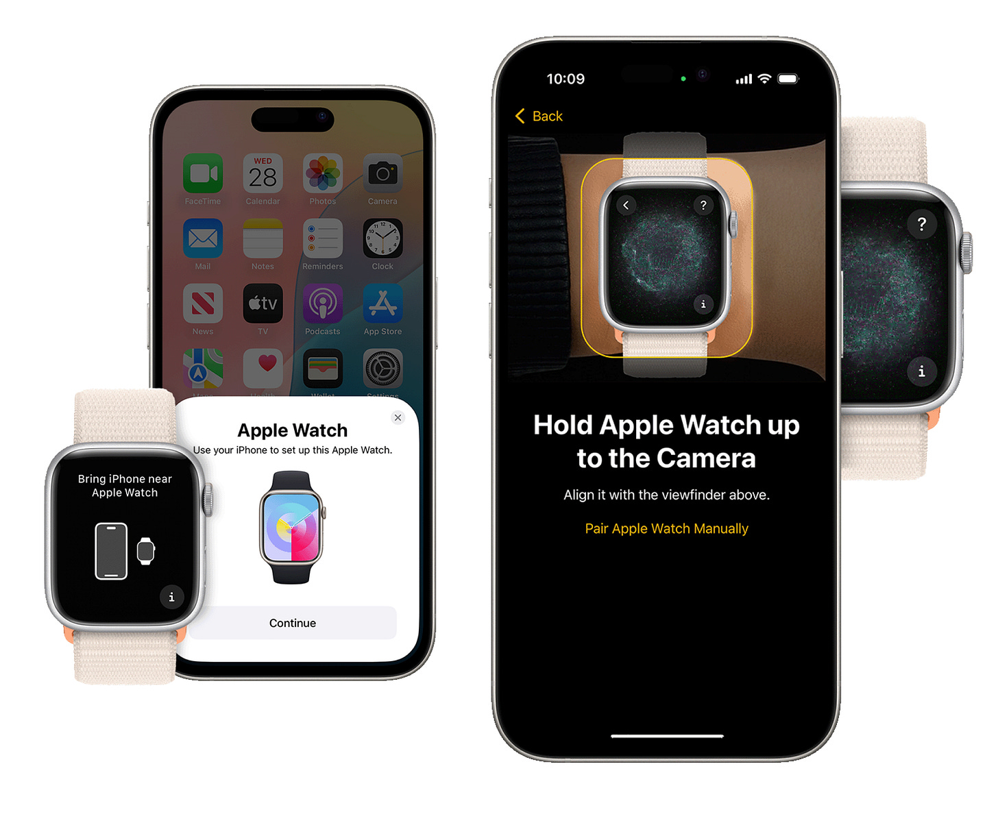
Below, the Apple Watch’s well-crafted onboarded experience anticipates user behavior by proactively reaching out and hand-holding the user through setup steps, heavily supported by visuals which provide affordances for what to do with the camera, as well as some magic a la the particle animation that provide visual feedback when the step is completed correctly.
2. Functional Craft
The product does what it’s supposed to do effectively and quickly — including those with disabilities — with no janky bugs or abrupt dead ends. It “just feels good”, with responsive interactions used with intention to support user behaviors.
• Frequently includes Product Design, UX Engineers, Motion Designers, Engineering, QA
• Example criteria to measure are latency and overall performance, quantitative data on different platforms, browsers, connectivity scenarios, open UX bugs
Below, Duolingo use smooth animation, even in a constrained web environment, to encourage users to start a lesson, color to denote progress, and character design to express enthusiasm and whimsy. The Avatar creator below is comprised of lightweight, vector-based shapes which help with performance, and use subtle, smooth animations to instill life in the character and providing visual feedback when edits are made. It feels high quality, playful and game-like.
3. Visual Craft
It’s easy to parse what’s important and what actions to take, it’s appropriately designed for the jobs it’s designed to do, and your target audience finds it appealing, delightful and on-brand.
• Frequently includes Product / Visual Design, Front End, QA
• Example criteria to measure are Design System adherence (ex. Type Hierarchy, Color Usage, standardized components, Accessibility), qualitative feedback, open visual design bugs
Below are three way-finding software platforms (clockwise from top-left) —Tom Tom, Apple and Audi. A well crafted in-car experience considers a driver’s mindset, visual vantage point and proximity of the driver in the car. Ideally — and Apple’s comes closest — minimal clutter, easy to read type, non-distracting animations and large, easy to tap actions within the driver’s arm reach are are safety-critical. Beyond that, a visual design needs to feel harmonious to the car itself — whether designed to fit a particular make and model like Audi OR designed to look universally great in any car, like CarPlay, while feeling like part of the Apple OS family.
What it looks like when it’s done right
Your users gravitate towards using your product, again and again. It may become easier to use over time, and ultimately, the design may become “invisible” as it becomes an essential part of your customer’s life. They may not totally know think about the “craft” of your software the way you might as a practitioner — say as a designer or PM or Engineer — but after countless of research studies and successful and unsuccessful product launches have proven the impact of Craft, I guarantee you your customers will know when it’s not there. And by that point, it might be too late to roll it back.


